
The difference between fashion and style is blurred when it comes to clothes or interior design; publishing also has its trends and its more enduring characteristics throughout history. A good example of a literary fashion could be the Victorian habit of giving chapters little abstracts, “In which our hero meets an unlikely stranger; the housemaid runs off with a rabbit; and there is an argument over supper.” Style is generally more uniform – guidelines, where to use a comma, the standardisation of spelling – but unlike what a person wears, literary style can become popular, it can be avant-garde or deliberately playful, and very occasionally it can endure. Think of it like the classic American styles of Ralph Lauren against Alexander McQueen and Moschino. Style is most commonly thought of as the theme in literature, but I’d argue that there is a spirited hybrid in terms of design as well.
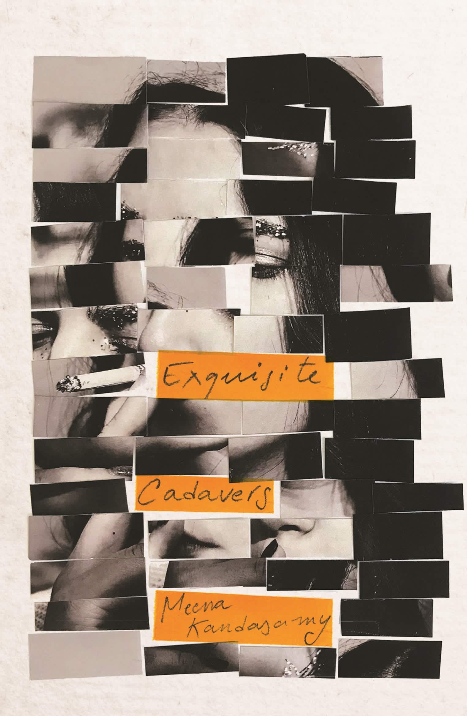
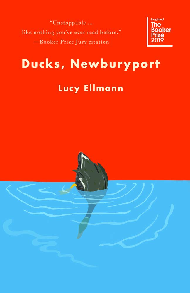
 Let’s start off with text. I’ve written about Max Porter’s Lanny before, with its almost-drunk typesetting curling around the page like visual poetry. Whatever, it’s been nominated for the Booker as it should have been, so I’ll instead discuss two novels that use text in completely different ways. Meena Kandasamy’s Exquisite Cadavers has the central part of the text set in a narrow column, with the sides given to annotations and fragments, a sort of vertical-style of footnotes. This builds up the narrative in pieces, resulting in an incredibly rich reading experience that encourages you to linger, cross-reference, and explore. In contrast, Ducks, Newburyport, the 1000-page opus from Lucy Ellmann, uses an almost continuous run-on sentence – the fact that you cannot stop thinking about this, the fact that it works in its entirety – and has been compared to ‘reading Ulysses where the cultural references make sense.’ This comparison made me pause, but Ducks works. The rhythm of the words, the continual word-play and cataloguing of desire is not as breathless as the writing style suggests. As a side note, I have been reading Berfrois: The Book, a collection of short stories and poetry edited by Russell Bennetts, and some of the later poems are so beautifully and visually typeset that it almost changes it into an art book.
Text is not the only way in which style permeates novels. One of the consequences of books becoming desirable items, with bookshop-specific special editions and re-releases, means that some older fashions are coming back in a fresh and reinvented way. In the 1750s some books had fore-edge painting, where the edges of the pages had extensive decoration. Some of these contained secret scenes, hidden by gilt and only viewable when the book was fanned out (if you are lucky enough to be able to get to the Bodleian, they have some excellent examples, including Bidcombe Hill by the Rev. Francis Skurray), whereas others were printed with heraldic symbols. The Dutch House by Ann Patchett, in a special edition for Waterstones, has exquisitely stencilled edges to imitate Delftware in a more elaborate return to this fashion. More simple examples can be seen on Laurent Binet’s The 7th Function of Language or some of the house-themed Harry Potter editions, but this level of decoration is almost worth the controversial ‘shelve your books spine-in’ Instagram trend. Almost.
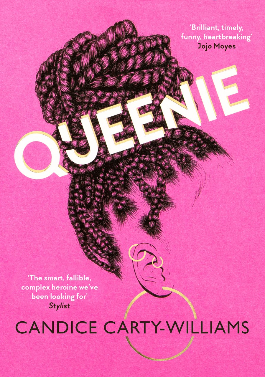
On the other hand, cover designs most definitely follow fashion trends – to the extent that a crop of titles will turn up looking almost indistinguishable, so closely do they adhere to a successful sales formula. The shocking-neon sans-serif on black-and-white for thrillers has been widely mocked for being over-done, and one of the things I have noticed in the 2019 crop is a tendency to cover up the title with elements of the cover artwork. This can work exceptionally well (Queenie by Candice Carty-Williams, Black Leopard, Red Wolf by Marlon James) but also risks becoming another standard design in the future. That is not to say that all cover trends are bad – even if they do seem repetitive. When the sheer volume of books being released makes it almost impossible to choose, a visual shorthand can indicate what you may enjoy, and what you may not. This does also carry the potential of you, the reader, losing out on something you might really enjoy. Some small publishers (for example Galley Beggar Press and Fitzcarraldo Editions) get around this by employing an almost ‘anti cover-design’, without decoration or embellishment, just a simple title and author name. Personally I love this pared-back elegance, reminiscent of novels in a French bookshop, but I look forward to seeing the next big look that becomes popular.
Perhaps on some level, both styles and fashions in book design and typesetting are self-fulfilling. Some of the books I have written about here have also come up before – in ‘books to look forward to’ features, for example. The way we buy and write about books can largely be determined by those that the marketers put their weight behind, and making the book look and feel appealing is a large part of that. On the other hand, stylistic themes – something I have largely ignored here in favour of a more literal interpretation of fashion – can be longer-running and reflect the mood of a population.