

Colour trends come and go, but others are undeniably classics and defy the test of time. Blue, in all its hues, brings calm, cool freshness to our homes, creating an effortlessly stylish look.
Ranging from dramatic, deep, dark navy to soft and gentle pastels, blue is a versatile colour that can be used in a wide range of homes, from the ultra modern to the country classic, in any room of the house. In its many shades, it can be layered up and mixed like no other colour.
Balancing act
If you love blue, but find it a little cold to live with, try balancing it with some warmer elements, such as a complementary colour for a striking look: orange, yellow, coral, pink and red, for example. A predominantly blue room will often benefit from an accent. There is no need to be heavy handed with this – less is more – and the accent need only appear in one, or a small number of objects. The key to success when adding a complementary colour is to choose a shade of equal tonal weight i.e. pastel with pastel and strong with strong.
As well as colours that are opposite on the colour wheel, blue also marries well with secondary colour combinations (colours that are next to it on the colour wheel/rainbow), such as uplifting green or pretty purple.
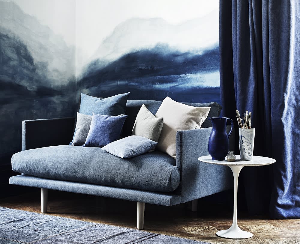
If this is too bold, try adding in gentle natural textures and warming woods. Put beautiful oak next to blue and it suddenly comes to life, preventing your scheme from looking flat. Also try adding in plants, wicker and baskets, furs and tan leather. A fashionable combination that also serves the same function is to pair blue with gold for a seductive, dramatic and glamorous space. Mixing up the tones of blue in a room, and layering pattern will add interest, depth and character, allowing for a more subtle variation and a less forced feel.
A classic combination
Arguably the most classic and timeless partnership when it comes to blue schemes is blue and white. The clean contrast can be used in different ways, from a dynamic statement to a pretty and airy feel.
Put white against darker shades of blue and it accentuates details, giving definition. A white fireplace, shelving or fitted cupboards painted white against a blue backdrop is a beautiful way to give depth and contrast. Conversely, blue pieces against a white background give a crisp feel, and can look contemporary or classic, depending on the style of the room.
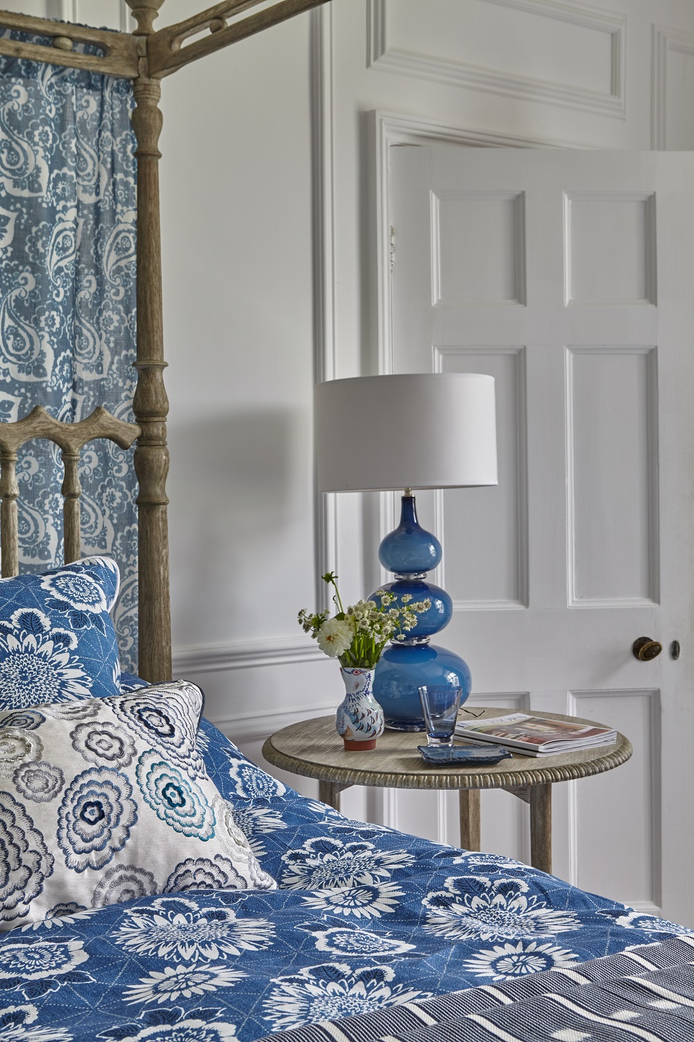
For a soft and gentle scheme, calming duck egg blue paints and wallpapers look fabulous with elegant off-whites – perfect for a bedroom or room to retreat to. Pair with natural linen and biscuit shades for a comfortable and relaxing feel.
However, there are other ways to create a blue scheme, without painting or wallpapering the walls. You could use blue as an accent to a neutral and pale scheme, by painting woodwork, furniture or alcoves, building up your scheme with gorgeous printed linen curtains, blinds, upholstery and cushions, or sumptuous velvets to add a rich pop of colour. This season has seen the release of many stunning new linens, making it easier than ever to find the perfect pattern and shade to suit your own individual tastes. Classic choices for patterns in blue are florals and toiles, and for a more modern look, bold geometrics and stripes. Another great way to give personality to a neutral scheme is with a stylish blue rug – an easy change that can make a huge impact to a room. Accessories are a great way to dabble in a colour without too much of a commitment.
Tip: When choosing a shade of white to go with blue, steer clear of pure brilliant whites, as they can create an icy atmosphere, flattening the space.
Create a mood
Calming, romantic, uplifting or dramatic… ? Colour is a powerful tool for building up a mood in a room, and there are many different moods you can conjure up with shades of blue.
Calming/peaceful
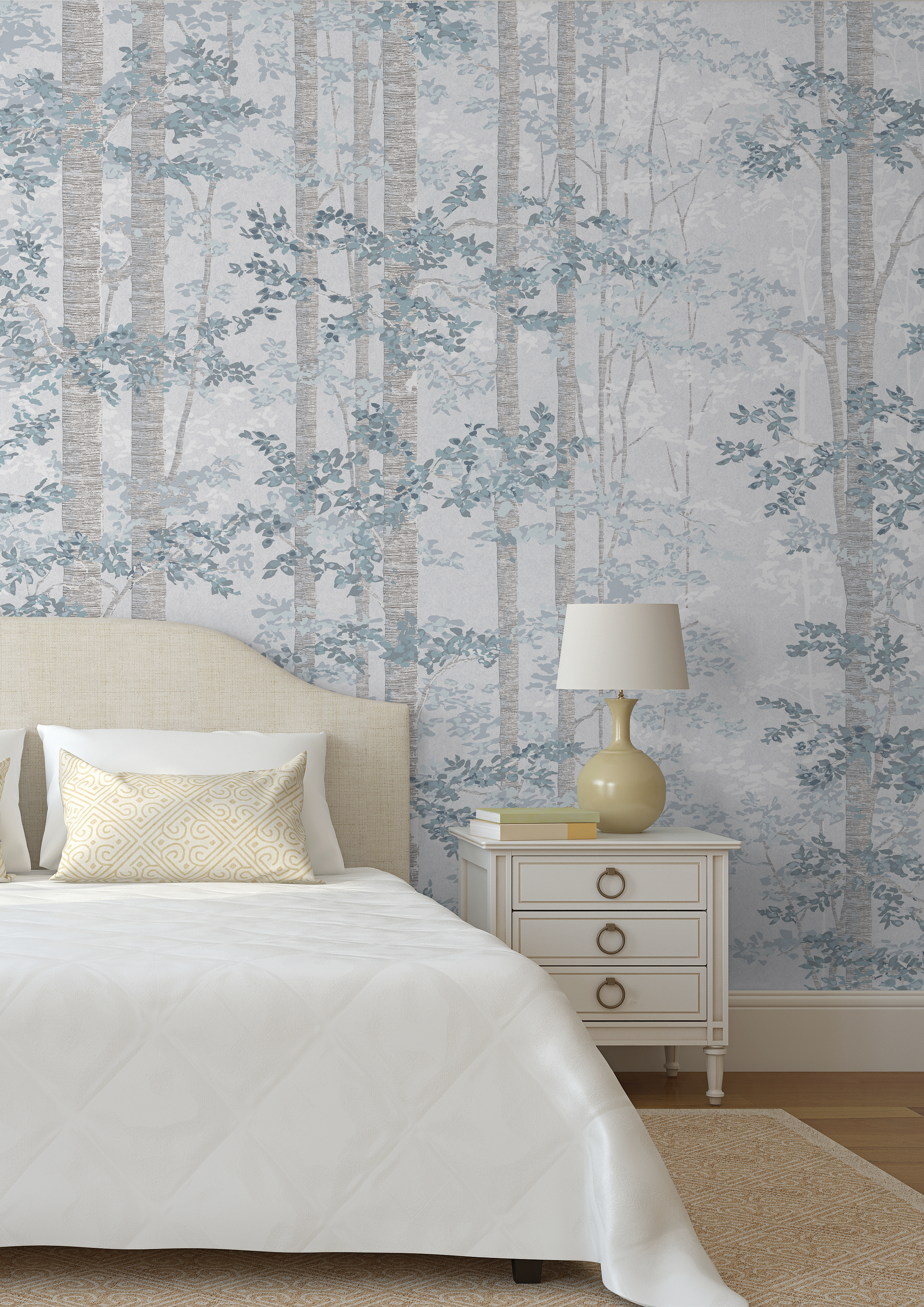
Choose soft and silvery blues for a restful space to sooth the soul. The palest of blues are perfect to create calm, as they are often associated with the natural world; faded skies and seas. Pale blue is a great choice for bedrooms because it recedes to the eye, rather than grabs our attention, making it restful to look at. Always consider the natural light of the room, as very pale shades of blue can look dull and flat when light is low, such as in a north facing room.
Positive/uplifting
Unashamedly confident, bright and fresh sky blues can give a room energy and feel uplifting, however, under lamp light or low light, have the opposite effect of feeling deeply peaceful – also a positive attribute – making sky blue a versatile colour that is suitable in most rooms, from bathroom to living room.
Pretty/romantic
Powder blue has a delicate beauty, and is a more subtle way to create a feminine atmosphere, other than the more obvious pastel shades. However, when used in botanical/floral prints and toiles, any shade of blue can take on a romantic but sophisticated quality. To successfully build up a pretty scheme, these patterns should be used against a pale and simple background that complements, rather than competes. Combining stripes and mixing the patterns adds layering and a smart formality.
Dramatic/glamorous
Dramatic can be achieved with electric shades as well as deep and dark. Think ‘impact’ and look for deeply saturated tones. Closeting yourself in a rich colour feels sumptuous and historically is associated with luxury. Try using it on woodwork as well as walls and soft furnishings for a really contemporary finish, or with crisp white for a high contrast statement. Cobalt can be a good choice for adding drama without getting too dark. Turquoise and bright aqua work well alongside deep and dark.